


Matcha Muse
OVERVIEW

The Product: Design platform that connects users new to matcha with various resource such as expert insight and unbiased reviews of top brands.

My Role: UX Designer designing an app and website for Matcha Muse concept to delivery.

Project Duration: August 2022 - September 2022

Responsibilities: Conducting interviews, paper and digital wireframing, low and high-fidelity prototyping, conducting usability studies, accounting for accessibility, and iterating on designs.
SUMMARY
I conducted interviews and created empathy maps to understand the users I would be designing for and their needs. For my research I conducted 5 one-on-one interview-style conversations with individuals who fall into the targeted demographic. A primary user group identified was adults who wish to learn more about matcha tea.
Initial assumptions focused on features like clear and concise language and visually pleasing interface. After conducting research, I came to find there was more of an emphasis on ensuring reviews are balanced and ensuring there are various sources of information on the platform.
PAIN POINTS

NEW RECIPESSome participants wished the recipes section would be updated on a consistent basis with new options.

UNBIASED INFORMATIONParticipants wished to confirm the information on the website is unbiased.

BRAND REVIEWS
Participants wished to see reviews on various brands of matcha. User Persona
BEATRIZ | “I want a way to learn more about the history of Matcha and best selections!”
Age: 22
Education: B.A. Auburn University
Family: Living with Partner
Occupation: History Teacher
Beatriz loves her job as a History Teacher. During her off time, she enjoys learning about various cultures throughout history. Specifically, she enjoys sampling different cuisines from these cultures. Still, Beatriz sometimes struggles to find credible reviews for less common food and beverage found in the United States like Matcha tea.
PAPER WIREFRAMES


DIGITAL WIREFRAMES
MAIN PAGELOGIN PAGEFor the Browse page, the goal is to help the users easily access relevant information based on categorization or search.
Login page should be simple and aesthetic, communicating the mission of the site and allowing for easy transition into account set up or main page.


LOW FIDELITY PROTOTYPES

USABILITY STUDY FINDINGS
I conducted monitored usability studies with five people between the ages of 25 and 65. Each person had a different background in experience with ordering food online and provided a variety of insights to help improve Sammie’s Sandwich Website.

Round 2 Findings
Round 1 Findings
Easily locatable expert for questions (update colors)
Add icons to account setup for better accessibility
Include a donate button since there is no kickback on product sales
Updated colors for better accessibility
Focus on streamlining login process
Ensure search functionality works
HOME PAGE
Changes to the homepage include adding accessible coloring and adding a top categories with a background image. Bottom section also readjusted per visual availability.
HOME PAGE AFTER USABILITY STUDYHOME PAGE BEFORE USABILITY STUDY

REVIEW PAGE
Updates included adding language to assure users this is an unbiased source of information for expert reviews on matcha brands. TAKOUT PAYMENT PAGE AFTER USABILITY STUDY
TAKEOUT PAYMENT PAGE BEFORE USABILITY STUDY


MOCKUP
Home Page colors updated to become more accessible, better allowing users to differentiate action oriented buttons and identify next steps per Gestalt Principles. “Talk to an Expert” tab added to every page for easy access.
OLD RECIPE PAGE

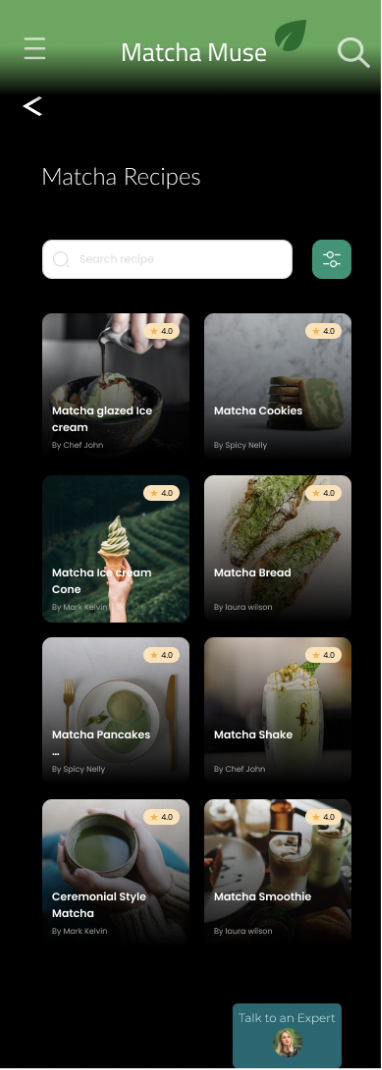
NEW RECIPE PAGE
Accessibility Considerations

Color combinations for easier reading.

Back buttons and straight forward language for each section.
TAKEAWAYS

IMPACT
The app provides an effective option for users on the go but a larger responsive design also allows for users to leverage the platform on a variety of devices.
One quote from participant feedback: “It was great how the app provided so many resources related matcha tea and did not sell out or promote a single product”.

WHAT I LEARNED
While designing the Matcha Muse App, I learned that responsive design means maintaining flexibility in how various features are implemented so that the app or desktop interface maintains its user friendly nature.
NEXT STEPS

Conduct another round of usability studies to validate whether the pain points users experienced have been effectively addressed.

Conduct more user research to determine any new areas of need.
LET’S CONNECT!

Thank you for your time reviewing my work on the Matcha Muse app! Feel free to reach out if you have any questions regarding myself or my work!