

Fresh Foundations
OVERVIEW

The Product: A streamlined sandwich delivery app for people on the go.

My Role: UX designer designing an app for the Fresh Foundations conception to delivery

Project Duration: February 2022 - May 2022

Responsibilities: Conducting interviews, paper and digital wire framing, low and high-fidelity prototyping, conducting usability studies, accounting for accessibility, and iterating on designs.
SUMMARY
I conducted interviews and created empathy maps to understand the users I would be designing for and their needs. For my research I conducted 5 one-on-one interview-style conversations with individuals who fall into the targeted demographic. A primary user group identified was adults who do not have time to prepare their own meals during the day.
Initial assumptions focused on features like clear and concise language and visually pleasing interface. After conducting research, I came to find there was more of an emphasis on security of personal information, speed of order process from beginning to checkout, and clear confirmation and transparency of order including updates regarding order status.
PAIN POINTS

CONSISTENCY OF USEParticipants stressed frustrations with websites/apps not responding or even crashing during order.
SPEED OF CHECKOUTParticipants emphasized importance of maintaining an efficient order flow in which little friction existed in order process.

DATA RETENTION POLICY
Participants wish to ensure personal information is secure and not receive subsequent promotions through contact information provided. USER PERSONA
JESS | “There is absolutely no time to waste in this high-pressure industry!”
Age: 26
Education: J.D. - UT Austin
Hometown: Austin, TX
Family: Living with Partner
Occupation: Lawyer
Jess is working for a prestigious law firm in Houston, TX. She is exceptionally career driven and often lacks time to make food during long work hours. She works from home with her partner who also works in a demanding profession and experiences similar time constraints. They try to coordinate food orders for maximum efficiency.
PAPER WIREFRAMES


DIGITAL WIREFRAMES
PAYMENT PAGEHOME PAGEFor the Browse page, the goal is to help the users get as much information as possible without needing to click to other pages.
The goal is to have a full overview of what is offered on the site and have it easy for the user to choose where they would like to navigate to next.


LOW FIDELITY PROTOTYPES

USABILITY STUDY FINDINGS
I conducted monitored usability studies with five people between the ages of 25 and 65. Each person had a different background in experience with ordering food online and provided a variety of insights to help improve Sammie’s Sandwich Website.

Round 2 Findings
Round 1 Findings
Colors need to be more accessible
Clear direction where to go to order on home page
Add feature that tells you how many items you have in your cart
Keep bottom consistent from page to page
Filter or search feature when choosing sandwich
Move bag and home page icons to the very bottom
HOME PAGE
Changes to the homepage include making the colors more accessible and reconfiguring the bottom panel.
HOME PAGE AFTER USABILITY STUDYHOME PAGE BEFORE USABILITY STUDY

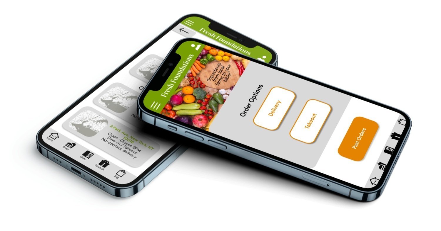
PAYMENT SELECTION PAGE
Updates included updating bottom bar for accessibility and removing delivery address reference from "Takeout" order flow. TAKOUT PAYMENT PAGE AFTER USABILITY STUDYTAKEOUT PAYMENT PAGE BEFORE USABILITY STUDY

MOCKUP
Home Page colors updated to become more accessible, better allowing users to differentiate action oriented buttons and identify next steps per Gestalt Principles.
OLD HOME PAGE

NEW HOME PAGE

Accessibility Considerations

Button colors adjusted for accessibility requirements

Icons simplified and readily accessible for easier navigation
TAKEAWAYS

IMPACT
The app provides an effective option for users on the go.
One quote from participant feedback: “I really appreciated the ability to get my standard order in a couple of clicks”.

WHAT I LEARNED
I learned that the first ideas of the app are just the beginning of the design process. Usability studies and peer feedback kept improving the app during each iteration.
NEXT STEPS

Conduct another round of usability studies to validate whether the pain points users experienced have been effectively addressed.

Conduct more user research to determine any new areas of need.
LET’S CONNECT!

Thank you for your time reviewing my work on the Fresh Foundations app! Feel free to reach out if you have any questions regarding myself or my work!